top of page

MOTSBOX
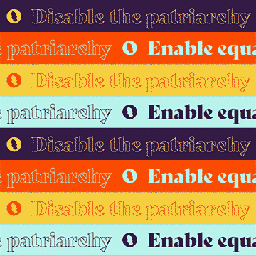
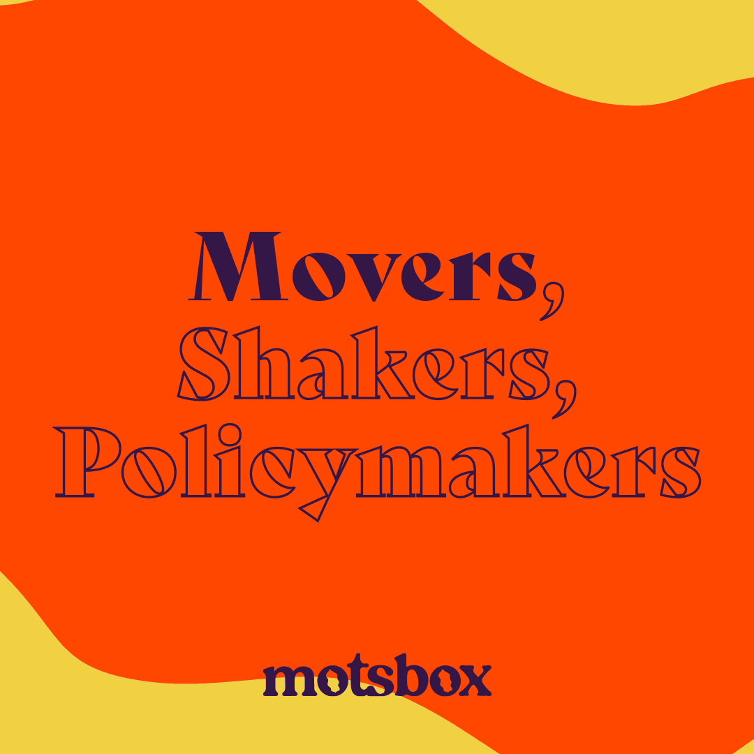
Motsbox is a movement, a media company, and a community. It was established to fuel discovery and diversity of marginalized and womxn-centered storytelling that is often overlooked and ignored by mainstream platforms. I worked with an international team to build a brand that helps the organization deliver narratives of pop culture, politics, and period awareness through engagement and action.
CLIENT
Motsbox
ROLE
Creative Director
Designer
DESIGN TYPE
Branding
Print & Packaging
Digital
Art Direction
Animation
Social Media Strategy
Anchor 1

MOT = Irish slang for woman/girlfriend
BOX = Soap Box, Vagina
M.O.T.S. = March on the Streets


BRIEF: Bright, bold, attention-grabbing, approachable, and clean & fresh as f***.
While strategically defining the visual meaning of the brief, I focused on subtle nods of the concept behind the company’s name, providing a visual metaphor for feminism.


PLEASE NOTE: The artwork displayed here as part of the Social Media Strategy is found and credited to the proper artist.

Anchor 2
bottom of page